
Why re-design a news website in 2025?
Reflections on giving Blog Preston a new look in the past fortnight

Good afternoon,
A different format for the digest today as I thought I’d share a few thoughts on how we approached the re-design of Blog Preston.
The independent local news site began in 2009 - remember when Wordpress blogs were all the rage? It was a freezing cold day in January, that much I remember.
I had significantly more hair and far less experience (one advantage of being younger, you’re more willing to be daring) so I thought starting something to try and help people keep updated on what’s happening in the city would be a good idea. The Lancashire Post did a decent job but the Preston Citizen free weekly had recently shut up shop and pulled out of the city so there was a bit of a gap.
Blog Preston - or The Preston Blog - as it was then (and is still referred to as, or just shorthand of ‘on’t blog’) began. I look back now and some of the stories make me cringe, but above all people found it useful. Forget journalism for a minute, people felt like there was a publication for them (Preston-focused, no Blackburn, no Blackpool etc) and it was timely.
Over the years it has professionalised, become a Community Interest Company and one of the best things I’ve ever done is invite other people in. From co-editors, to freelance writers, to people who take pictures, to people who send tip-offs about specific stories, there’s a community around the site.
So I was nervous when it came to giving it an upgrade. The last time it had been touched was 2016 and let’s just say there was a lot of sticky tape around the back keeping the show on the road.
We’ve worked with 3 Man Factory, a digital, brand and web development agency based in Preston, ever since Blog Preston began. Funnily enough the first time I met James Duffell, our technical wizard on all things Wordpress, was due to a story. While working for the student paper he gave us a tip-off about the electricity substation next door to the university’s new fancy Media Factory building (ironically where I help on the Journalism Leadership & Innovation course) going up in flames as it had been over-loaded by the enormous new building next door. He sent pictures and video, what a forward-thinking guy, and so we kept in touch.
Sitting down over the last few months we’ve worked through what we wanted to achieve with giving Blog Preston a new look, they could broadly be jotted down as:
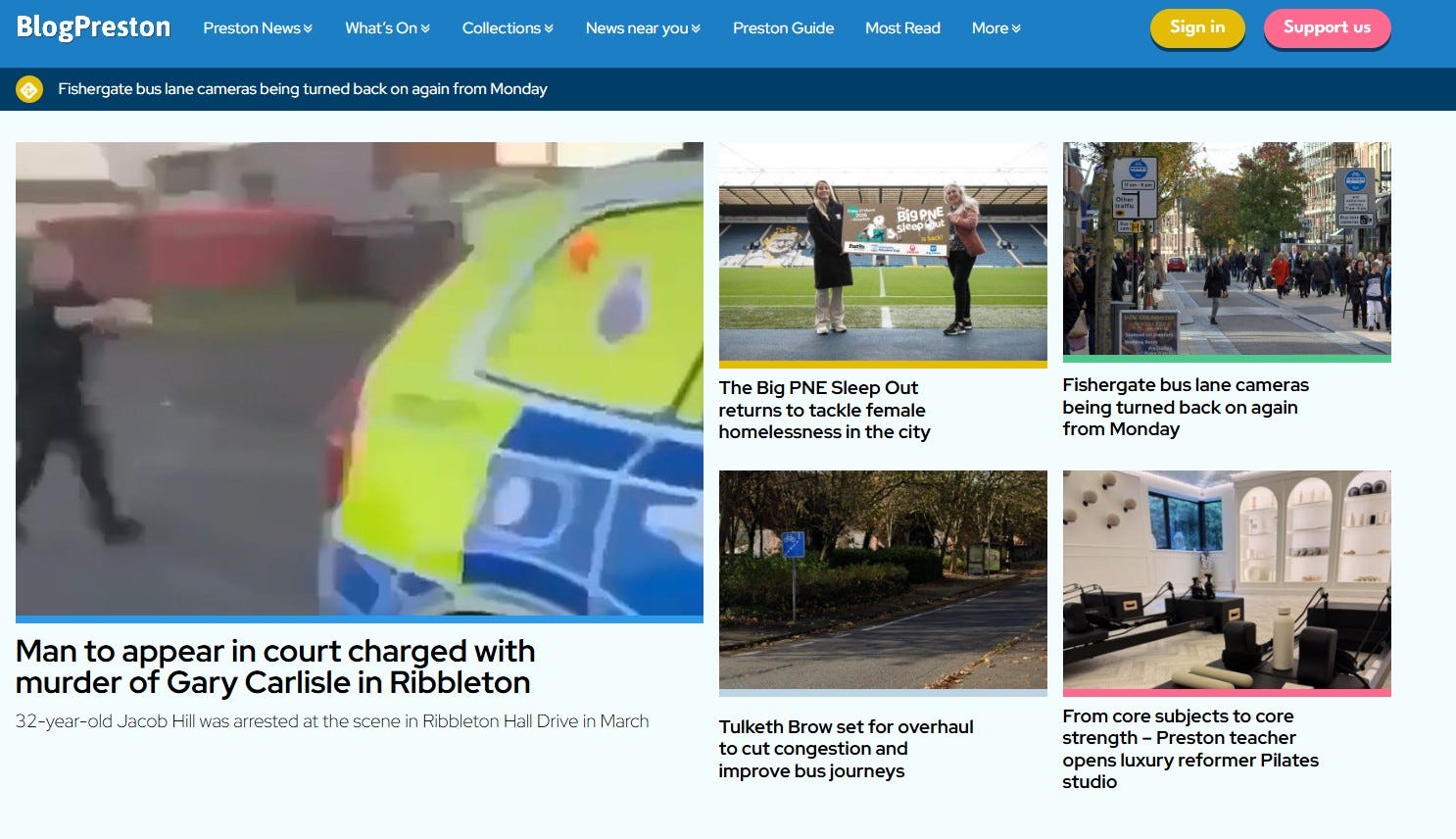
Greater editorial control. You might think in the world of AI this really isn’t needed anymore, but the old BP site worked solely on chronology of publication. This is good as people like the simplicity but meant sometimes a strong and important story, or one lots of people would be interested in, was quickly buried by other stories. Adding a featured stories area was important for being able to showcase stories and show-off the range of stories we have too. We also wanted to make it clearer on our bylines there were humans writing the stories (so pictures, titles etc all included).
Introduce a reader contributions model. Blog Preston has been predominantly advertising funded since day one. We’re not ashamed of this. As a community interest company that goes back into ensuring we can continue our community reporting. But the technology has advanced enormously for allowing people to contribute financially, directly, to supporting a cause - be that a charity, a subscription, or anything else. We know people do value what we do, and so we wanted to give this option. We felt a paywall didn’t sit right with the aims and objectives of Blog Preston, a lot of our stories are community-driven information, why would we charge people to access this?
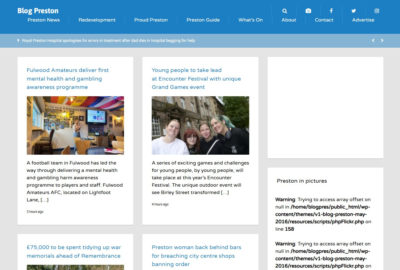
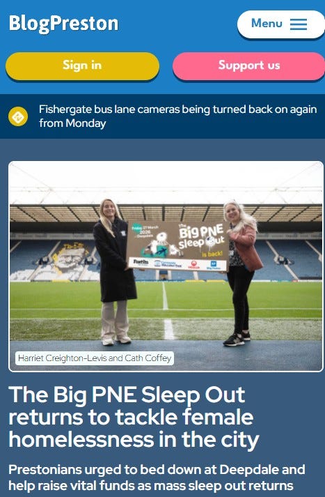
Making it look professional. This might sound an odd point, but Blog Preston’s readership likely puts it as one of the larger independent news titles in the UK. In May we ranked in the top 30 most engaged with local news websites (independent or established), our stories are regularly followed-up by local, regional and sometimes national media. There’s 140,000 readers-a-month visiting the site, sometimes more, it was important it reflected the effort, resources and focus which goes into it. It was also very blue, we felt building on our what’s on re-design last year it was important to bring through some other colours too. We also spent a lot of time ensuring on mobile the stories were easy to read and we were making more use of headline fonts, images and also our new alert bar to put a story across every page of the site.
Reducing technical debt. There were lots of things bolted onto the site, over the past decade, which were no longer needed. Other things had been crow-barred in (technical term, Duffell would say something involving more expletives here). A fancy way of saying, we wanted the site to load fast, be pleasurable to use and read stories on and the adverts not to be too disruptive. We also made changes in the back-end of our Wordpress set up to help with laying out stories. If you’re going to spend hours each work working with a tool then it’s worth making sure it’s good to use!
How has it gone?
Well, the number one aim was to ensure the whole of Blog Preston didn’t implode. The site was down for just over an hour while the work was done.
Our audience numbers on Google analytics, our referrals from search, social and other platforms are all steady (if not showing some slight improvement, but that could just well be down to events), and our advertising rates from Snack Media (the digital agency we plug into for advertising) are solid (and again, slightly improved but it’s too early to say the cause of this). And we’ve had an encouraging number of people and organisations sign up to support what we do as well. This is perhaps the greatest indicator of the re-design bedding in well.
One of the things I wanted to do as use the new-look site as a way to talk to people about what we do as Blog Preston as well, and learn more about why people read it. We spend a lot of time talking to people for stories but not actually about what we do. This is not uncommon for media organisations, we’re busy and so is everyone else!
In June we brought together a group of readers and representatives from organisations we talk to a lot (local business group, police, MPs, council etc) and we showed them a work in progress design. We got their feedback and made some tweaks as a result, and it helped validate the path we were on. We had spent a fair bit of time with only a small group of self-interested people (i.e. us!) looking at the new design by that point.


Another thing I wanted to do was understand what would make someone actually sign up to support us. When the first membership dropped in, I sent that person an email to say thanks - and asked if they would be free to speak on the phone for 10-15 minutes and I could ask them a few questions. It was a nice chap called Rob from Penwortham and we had a good convo last week, where he gave me some food for thought about further tweaks to the new look and also just general feedback. It was reassuring and a good way to get new ideas too.
There’s still loads more we want to do (there always is) but it’s a first-step for us on a road to becoming even more engaged with the communities we write about. Thanks to everyone who has taken the time to tell us things about the new look, thank you to the silent mass majority who have just carried on using Blog Preston in the past two weeks and thank you to everyone who has been involved in the new look.
Thanks for reading, as always, and digest back to usual format next week. Have a great rest of the week.
Keep going.
Ed