Review: Leeds University Union's new homepage

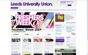
As web & digital marketing co-ordinator for a Students' Union I'm constantly taking a peek at what other unions are doing with their websites. It's interesting to see the diversity across the sector, with some sticking to rigid templates while others go to bespoke designs. Leeds University Union is one of the leading unions in the UK and at UCLan we often take a lead from what Leeds are doing - and when Leeds launched their new website powered by the Membership Solutions Limited system it was well worth a look.
The first thing that hits you is that they've managed to fit a lot more onto their homepage than previously, really showcasing what their Union does and has available for students. Here's what I like and don't like about it.
Loving

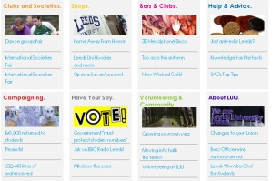
Their mid-page navigation is a really sharp design. Very often there's so much in the top navigation that should be showcased on the homepage but there just isn't the space and the homepage would end up cluttered if everything was. They've pulled news stories and content through from each section featured in the mid-page navigation and opened up those sections, plus it's bound to keep those staff in those departments happy that they've got a presence on the homepage.
The crispness of the design is quality. It matches Leeds' corporate colour scheme but doesn't come across as a corporate site. They've pulled a lot of content through and for the students there's loads of click on, follow and find out about - which is great for new students coming for the first time but also for returning students there's the chance to get involved again. The website makes you feel that there's always loads going on at the Union and that you should be involved.
Not loving

The tabbed news box, a good idea and used on many sites but their tabs aren't very clear - that they are tabs. I went to click the four links thinking they would take me off to other pages, not just change the tabbed news story box. Could do with a bit of tidying up to make it clearer.
Leeds aren't making use of their social media either. There's no photo integration onto the homepage, a lack of video (surprising for Leeds, as they do a fair bit of video) and twitter/facebook is nowhere to be seen.
The Job Link integration (the student job agency) is a little clunky as well, just listing the job title doesn't seem enough, could do with another piece of info such as closing date or location or wage. And also a little sentence explaining what Job Link is?
Overall the site is very well put together and a big step forward from the previous homepage.


